Historic landmark
A recognizable Tiffin building with two centuries of local meaning.
 Pioneer Mill — Case Study
View restaurant concept →View concept →
Case Study · Pioneer Mill of Tiffin
The research, choices, and iteration behind a hospitality concept designed to make Pioneer Mill feel like a destination before a guest arrives.
From concept to editable system
The original HTML, CSS, and JavaScript concept was converted into a custom WordPress theme so the experience could demonstrate both guest-facing design and practical staff publishing. Editable content now includes Events, Menu Items, menu categories, Dining Spaces, shared restaurant settings, and key homepage content.
The implementation was production-tested with responsive QA from 320–1920px and 15 live smoke checks, alongside semantic markup, appropriate ARIA, keyboard behavior, deployment rollback copies, automated backups, authenticated WordPress email, and no-index safeguards.
Boundary: this is an independent, uncommissioned implementation concept. It is not Pioneer Mill's official website or client work.

01 · Brand strategy
A recognizable Tiffin building with two centuries of local meaning.
A setting guests deliberately choose for dinner, atmosphere, and celebration.
A place where local history continues through shared meals and family stories.
The communication problem
Pioneer Mill already had the strongest raw materials: authentic history, distinctive architecture, the Sandusky River, multiple dining environments, and a natural role in local celebrations.
The experience organizes those assets around a guest’s decision. Practical information stays easy to find, while the setting explains why Pioneer Mill is worth choosing.
Where the concept began
After dining at Pioneer Mill, I saw the potential for a place people choose when dinner should feel like an occasion. Inside the restaurant, history lives in the building, the river, the dining rooms, and the feeling of being somewhere that has accumulated generations of stories.
The physical experience felt richer than the digital one. The goal became translating more of what makes Pioneer Mill memorable into the experience before the visit.
History, distinctive architecture, multiple dining environments, food, and private gatherings were already part of the business.
The concept does not invent a new Pioneer Mill. It gives the existing experience hierarchy, context, and a clearer path from curiosity to action.
02 · Existing experience
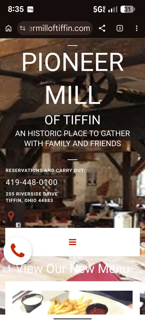
The homepage immediately provides useful contact and menu access, but branding, contact details, floating controls, photography, and navigation compete within the same phone viewport.
What the evidence tells us
The opportunity is not more content. It is clearer hierarchy, stronger atmosphere, and easier decisions.
Verified current-site evidence
The captures document the current navigation, history, dining spaces, and banquet path—the raw material the concept reorganizes.
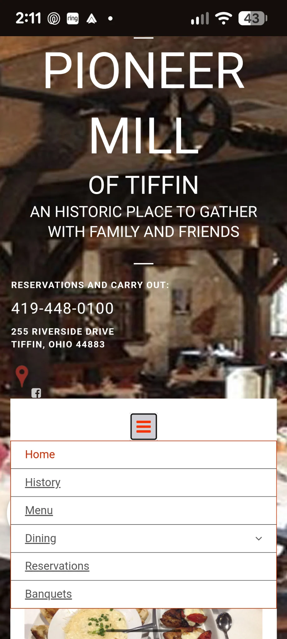
The expanded menu exposes the site structure at once: six top-level destinations plus three dining pages. The concept keeps orientation visible while reducing the amount a guest must parse at one time.
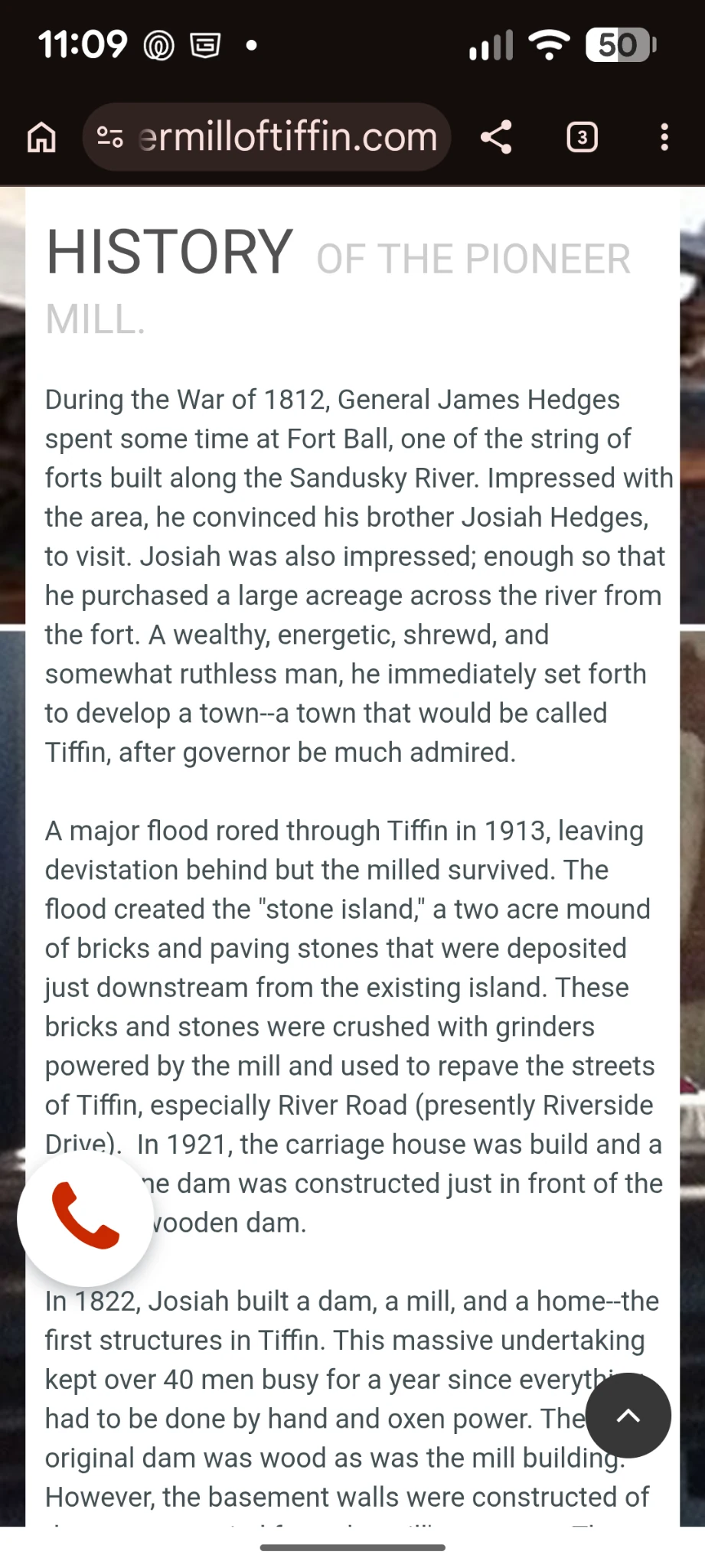
The site already contains substantial historical material. The concept does not invent that story; it brings the landmark’s history into the main dining experience where it can support destination value.
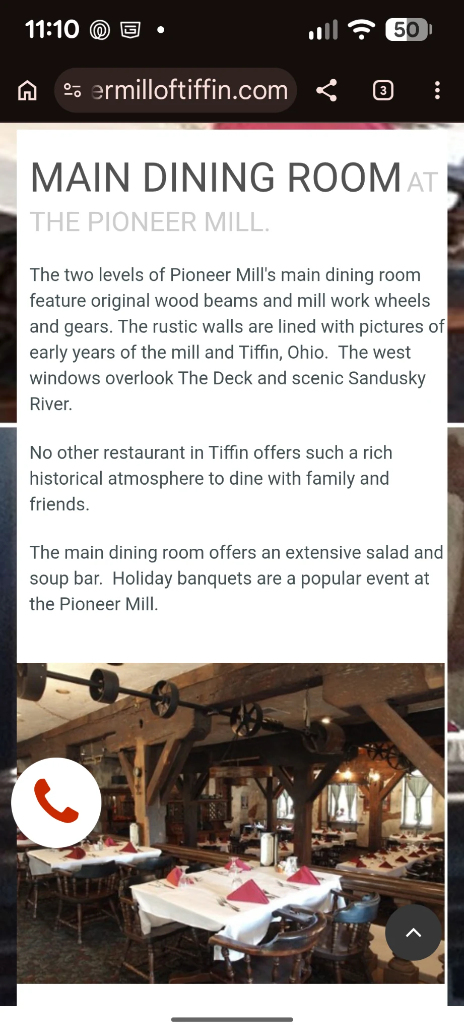
The Main Dining Room, Tinker’s Dam, and The Deck are real, distinct offerings presented on separate pages. The concept turns those choices into a guided comparison without making guests repeatedly leave the experience.
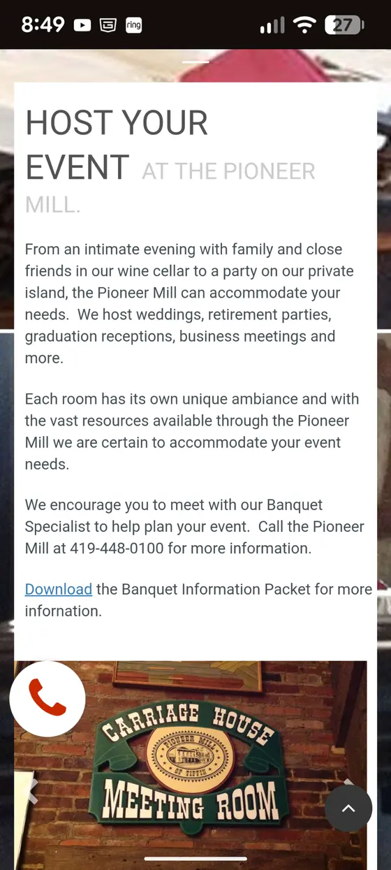
Banquet copy, specialist contact information, and a downloadable packet already exist. The redesign gives those capabilities a more visual path from discovery to inquiry.
Design implication: preserve the useful facts and established offerings, then connect them through a calmer hierarchy, clearer comparison, and more direct action paths.
The business case
The concept preserves the facts and offerings already published by Pioneer Mill, but reorganizes them around the decisions a prospective guest or event planner is trying to make.
Bring the building, river, and history into the main experience so guests understand why dinner here feels different.
Let guests compare dining spaces, explore the menu, and reach reservations without repeatedly leaving the experience.
Give private events a visual path from imagining the occasion to sending Pioneer Mill useful inquiry details.
Intended outcome, not an analytics claim: help guests understand what makes the Mill worth visiting, find what they need with less effort, and feel ready to reserve or ask about an event. Results would be measured after launch.
03 · Creative system
Identity rationale
The emblem combines the mill structure, waterwheel, and Sandusky River. Its seal suggests the permanence of a maker’s mark; the wheel and river keep it active rather than nostalgic.
Testing revealed that the complete storytelling lockup became difficult to read inside navigation. The client-facing system now uses one consistent wheel-and-wordmark lockup with a larger “Of Tiffin” line across compact headers, footers, and proposal touchpoints.
Website navigation · Mobile headers · Compact digital applications
Provisional identity explorations
These marks are compositional studies used to test tone and responsive application—not final identity recommendations.
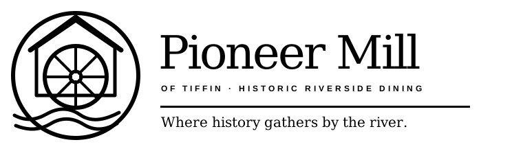 Historic,recognizable, refined
The established concept with fewer competing lines. The roof, wheel, and river remain distinctive while the simplified structure reproduces more cleanly.
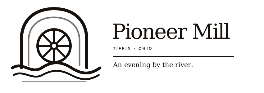 Elegant andunmistakably a mill
A waterwheel inside the historic arch creates an immediate mill reference while retaining the quieter destination-hospitality character.
Typography
GeorgiaA sense of place should feel remembered.
Avenir NextGeorgia was selected because it bridges editorial elegance with excellent digital readability, reinforcing Pioneer Mill’s historic character without feeling antiquated. Restrained Avenir Next labels keep navigation and practical details clear.
Color
Stone, timber, aged metal, paper, and warm evening light establish a palette that feels discovered rather than applied.
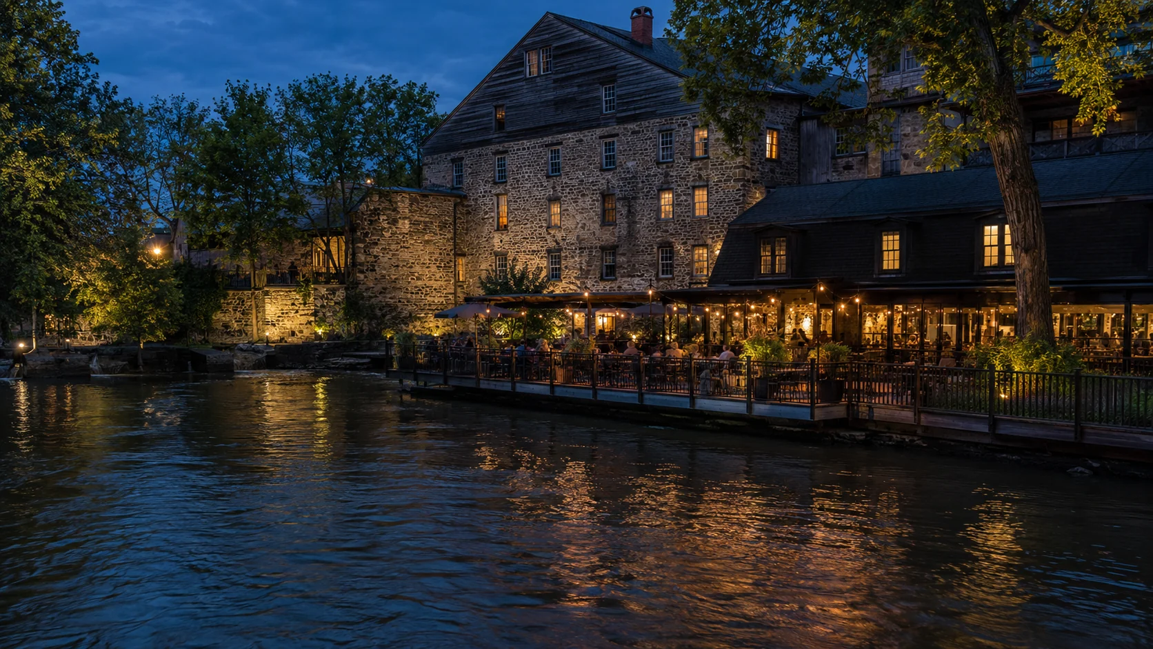
Photography
Adam can plan, photograph, edit, and optimize the food, spaces, service, and river light that answer the emotional question: what would it feel like to spend an evening here?
Spacing & editorial rhythm
Generous spacing, full-bleed landscape photography, compact utility moments, and quiet transitions prevent the long-form story from becoming visually repetitive.
04 · Experience design
The earliest structure established a clear path from arrival to story, dining choices, menu, celebration, and reservation.
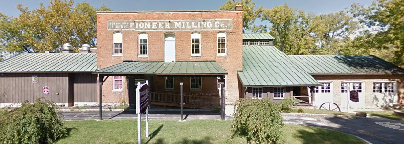
Authentic and recognizable, but too static to create desire on its own.
Warmth, people, service, and movement turn the landmark into an evening.
Serif expression carries memory and occasion; sans-serif utility maintains clarity.
The guest journey
Open on life, warmth, river light, and a reason to want the experience.
Establish the mill’s role in Tiffin through history, archival imagery, and timeline.
Introduce dining settings and featured dishes before presenting exhaustive details.
Use atmospheric pauses and celebration imagery to make the experience memorable.
Close with clear reservation, directions, events, and contact paths.
Strategy becomes interface
A static exterior established architecture but not desire. The current direction introduces guests, service, movement, warm windows, and golden-hour river light.
Featured dishes now lead with photography and appetite. The homepage keeps a focused menu preview, while “Full Menu” goes directly to a dedicated responsive menu page. A consolidated three-page PDF remains secondary for guests who want to save, share, or print it.
The current site already distinguishes the Main Dining Room, Tinker’s Dam, and The Deck. The concept combines those established environments into one anchored comparison so guests can understand the differences without navigating among separate pages.
The current site already promotes private gatherings, a Banquet Specialist, and a downloadable packet. The concept preserves those capabilities while bringing them into a more visual path that helps groups picture the occasion, share useful planning details, and give the Banquet Specialist a stronger starting point for the first conversation.
The existing History page already contains meaningful detail. The concept reorganizes that material with year anchors, archival pauses, and a clearer sequence so the story is easier to scan and remember.
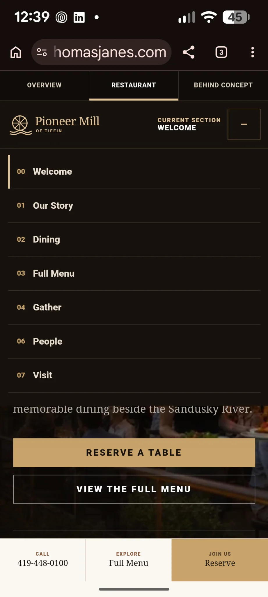
The phone number explains the call action; Facebook stays visible without competing with reservations. A persistent mobile bar keeps Call, Full Menu, and Reserve within reach.
The downloadable menu was rebuilt as a purpose-made three-page document rather than a browser printout, with categories kept intact and typography checked for clean reading. View the three-page menu PDF ↗
The desktop sequence follows the questions a guest is likely to have—Our Story, Dining, Full Menu, Gather, People, and Visit. “Full Menu” means exactly what it says: one action opens the complete responsive menu rather than dropping visitors into an intermediate section.
The operational layer
Fritz is playing Friday? Add him. The kitchen changes its monthly feature? Update it. Thanksgiving reservations open? Put it in Coming Up. Someone asks about a rehearsal dinner? The inquiry is waiting in the same dashboard.
The point is simple: staff should not have to hunt through the website—or call a web developer—for routine changes.
Working prototype · Staff view
The Staff Dashboard concept brings private-event activity, Live Music, Featured at the Mill, and Coming Up into one control-center view, showing how common edits could stay close at hand.
Explore the Staff Dashboard concept →Live music, featured dishes, and upcoming occasions give guests a reason to return.
Update the relevant item in the dashboard rather than editing the public page itself.
The same content model feeds the guest-facing Happening experience.
A guest can describe the occasion, preferred date, party size, contact information, and what matters to the gathering. The dashboard gives staff a place to review that context, change the inquiry status, add notes, and track follow-up—supporting the Banquet Specialist rather than replacing the personal planning conversation.
The dashboard proves the intended workflow and interaction model. A commissioned build would still require final data storage, permissions, integrations, operational validation, and production QA before it should be treated as the restaurant’s live business system.
05 · If commissioned
A commissioned build would validate the concept with ownership, replace demo content with approved production assets, connect real systems, and test the complete guest and staff experience.
Outcome
The concept now demonstrates both sides of the experience: what guests see and how staff could keep it useful. Production integrations, operational validation, and measurable results would follow only after approval and launch.
See the thinking in action
The strategy only matters if
the experience carries it through.
Explore the restaurant concept as a guest would, then continue to the proposal to see how the concept could become a production-ready Pioneer Mill system.
NEXT STEP
The proposal turns the concept into a practical scope: website production, the Staff Dashboard, photography, private-event workflows, launch support, training, and final files.